The Hulu Project
Adding a Feature
August 2022,
4-week sprint
My Role: End-to-end designer
Tools: Figma, Maze, Zoom, Discord, Optimal Workshop, Jotform, and Miro
The Client
Hulu is an American subscription streaming service that provides public sports, news, and events. It is part of Disney's media and entertainment distribution segment, and it is the only on-demand streaming service that provides access to shows on every major broadcast network. The streaming service offers licensed content, such as award-winning Hulu originals with or without commercials.
Problem
Hulu doesn't allow users to share their thoughts on the movies and tv shows provided.
Hulu has no way of letting users communicate.
Hulu does not notify users when there is a new episode.
"The mission of the cohesive branding and the ad campaign — which spans TV, online, social, outdoor, and mobile — is to establish Hulu as the service that connects people with all the content they love and the starting place for their streaming experiences.”
-Hulu
Solution
Hulu should provide more services to connect individuals socially. I created a feature that allows Hulu users to comment on individual tv shows or movies and add likes or dislikes. This will enable users to share opinions and communicate with other users. I have also created a notifications page and history, so the user can find an old comment easier or see when their comment received a reply. There are very few streaming services that provide a community commenting option. Thus, it would set Hulu apart from others while giving current users more features to enjoy.
Research and Planning
Mixed Methods Survey
Have you ever wanted to leave comments on a movie or TV show?
Please rate Hulu in the following areas (If subscribed)
Which device do you use to watch streaming services?
This survey determines users' streaming habits, motivations, frustrations, and views of any feature suggestions. I also wanted to see if users would be willing to make comments if a social feature was added to Hulu.
Participants
Both females and males
The target audience is aged 18 to 49
Key Findings
20% of participants used Hulu
40 % of participants preferred to use a desktop computer rather than a mobile phone or Ipad.
60% of participants would leave comments on movies or tv shows if given the option
Advertisements and expensive pricing were common issues mentioned throughout the survey
3 out of 5 noted that the subtitles were the main feature they used on streaming service
Competitive Analysis
Competitive analysis was chosen to find out what beneficial features other streaming services provided. I wanted to predict the potential customer wants for streaming service features. It will help discover potential gaps in Hulu’s services.
Findings
Many want to have a way to see what others are watching and see what's popular.
Users don’t enjoy advertisements or low-quality TV shows.
Connecting with an audience is an essential feature that indirect competitors possess.
Connection through typical movies and TV shows
Multiple streaming services are dependent on ads.
User Persona
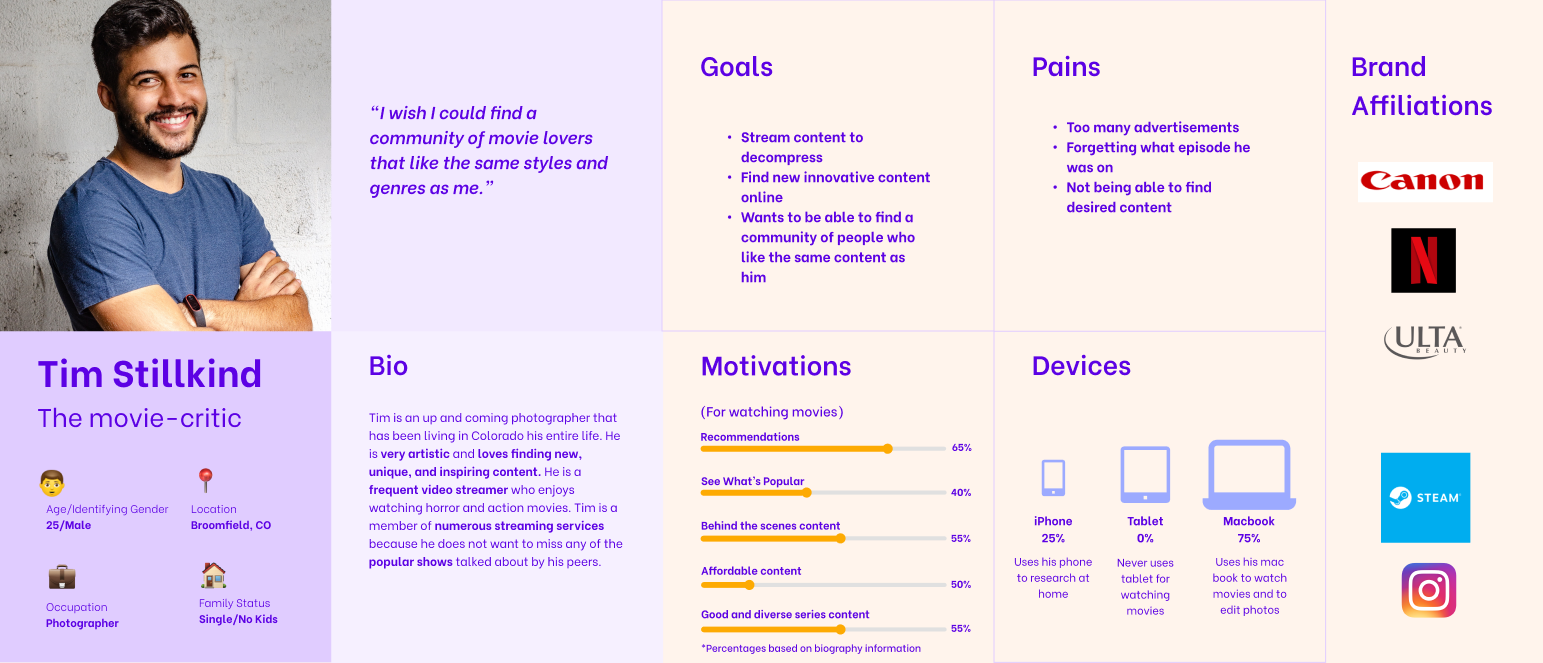
Creating a user persona was crucial when determining what kind of customer I would design for. I implemented the information from the previous survey to create a user looking for a community of movie lovers who liked sharing their opinion on movies. One of the pain points I noticed was the inability to find content, so I wanted to ensure that there were plenty of options to help the user find what they are looking for. If users want to add a comment, they can do so on numerous different pages on Hulu. The “find a community of people who like the same content” goal was also prioritized and will be achieved by adding the comments page.
Provisional Personas
I created a user persona but still wanted a better understanding of what users want and need. I had a strict time limit, so I used provisional personas to grasp what a Hulu streamer preferred in their subscription service. The personas below wanted to share opinions with a community, connect with others, and see what others are watching.
Goals
2 out of 6 wanted more exclusives or new content in their streaming services.
2 out of 6 participants mentioned wanting discounts on their streaming services
Frustrations
2 out of 6 participants mentioned that they did not like advertisements
Half of the participants noted how expensive streaming services could be at one point or another, according to the survey
2 out of 6 participants mentioned missing seasons as a frustration
Needs
2 out of 6 mentioned that they needed a place to make a playlist or sorting feature on their streaming service
4 out of 6 participants mentioned needing variety and a diverse amount of content
2 out of 6 said requiring a more accessible search feature
Project Goals
After doing much-needed research, I put together a Venn diagram of goals to discover similarities and establish project priorities. I created these project goals by finding the most common goals in all my other research methods and comparing them. The points I wanted to focus on were interacting with the audience, a way to comment and share, and accessibility.
Information Architecture
Sketches
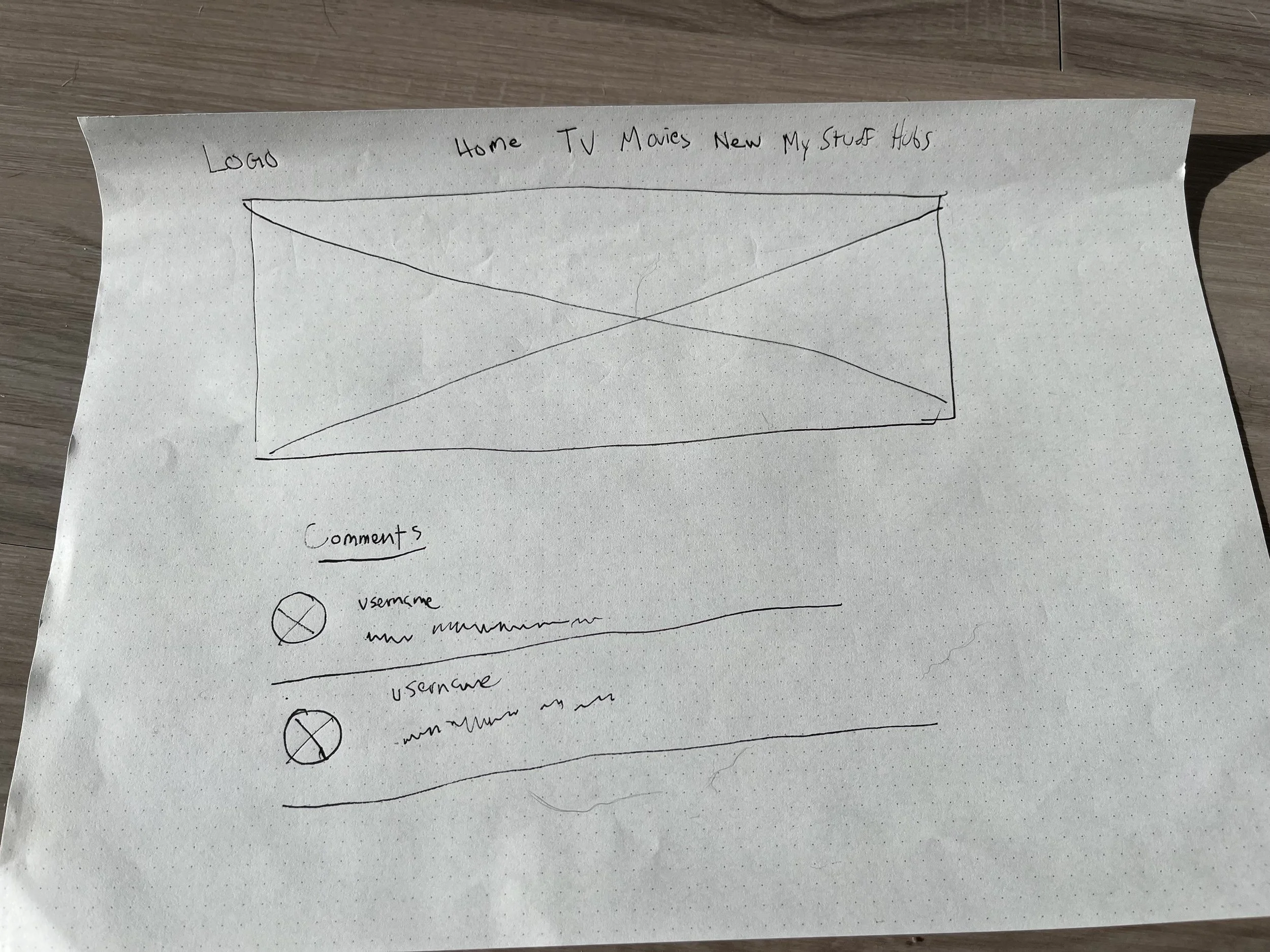
I curated ideas in my head by drawing inspiration from Dribbble and Pinterest. I tried to figure out a way to create a consistent addition to the movie description and watch page. I also tried to figure out how to make a notification page.
Site Map
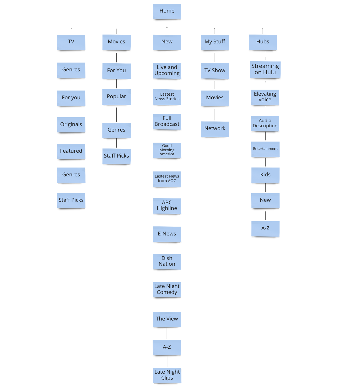
A site map was created to familiarize myself with Hulu’s website. Even though I’ve had a Hulu account for a while, I wanted to get a firm grasp on how it was categorized. I went through every page of the website and recorded the categories for each page. This would be essential later when coming up with the notification history and adding content to existing pages.
Task Flow
This particular task flow was created to visualize a user going through the Hulu desktop website and adding a comment after watching a movie. Creating a task flow was crucial when understanding how the user moved around the Hulu website for consistency and creation.
This sketch was drawn to determine where the comment button would be on the movie viewing page.
The notification page needed to be consistent with the other pages on Hulu.
I wanted to make sure that the user had multiple options on where to leave a comment, so an alternative is added to the movie description page.
A comment section is added so that the user can leave a comment while still viewing the movie or TV show.
I sketched the homepage to understand Hulu’s structure and layout. I also wanted to determine where the notification button would be added.
Low and High-Fidelity Wireframes
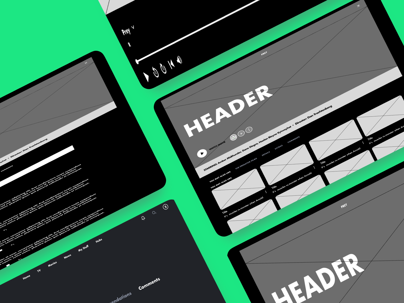
After walking through the structure of the original Hulu wireframes, I tried to create additional features. Again, consistency was crucial, and I wanted to ensure the new parts' design fit the existing Hulu web pages. I followed my sketches when trying to create the notifications page and comments addition. Creating high-fidelity wireframes was simple because Hulu already has an excellent color scheme. I replicated the color scheme among the new features and created written content inspired by looking at user comments on other websites and the structure of other notification pages.
Low-Fidelity Wireframes
High-Fidelity Wireframes
Usability Testing
The high-fidelity wireframes above were used to develop a prototype and test whether users could find the commenting section easily and whether they would want to use this type of feature.
Affinity Map
Test Goals
To see if the user can easily find the comments page and leave a comment
To discover errors that block the user from completing a task successfully
To acquire a 100% error-free rate
To evaluate how the participants felt about their overall experience
using Hulu.
Test Objectives
To discover potential usability issues and errors for adding and replying to comments.
To see if the user finds the commenting experience engaging and immersive
Identify missing objects that are necessary or desired
Participants
Number of participants: 5
Gender: A combination of both male and female users (2 female and 3 male)
Martial Status: A variety of married and single (2 married and three single
Age group: 18 to 49
Goals
100% Completion rate
100% Error-Free rate
Pros
Accessible and everything is easy to find
Easy to navigate
Cons
It took some participants a few minutes to find the comment button
People already receive too many notifications
Maze Results
Findings:
2/6 people would not or rarely use the comments if they had the option on a streaming
2/6 participants would use the comment sections to view but not leave a message
2/6 participants would use the comment feature to leave opinions and see other comments
Over 1/2 of the participants wanted to be updated on comments if there was a notifications page.
The comments button might need to be moved because some participants had difficulty finding it.
The number of comments should be mentioned in the notifications.
Test Methodology
Remote: I will conduct this test by sharing the link in Discord and using friends and family members.
Unmoderated: I will watch users' clicks via Maze.
Tools: Maze and Discord
Prototype
You want to watch the new Hulu exclusive, Prey. You would like to leave a comment about your opinion of the movie. Go through Hulu and leave a comment after watching the movie.
Mission results asserted by:
Tester Path
Click to watch the movie prey, then leave a comment.
Scenario
Iterations
During testing, some users were confused about how to add a comment. Instead of pressing enter to add an addition, there is now a button to confirm a finished comment. A plus sign button was added at the right of the comment field to let the user know there is a button to submit the comment once completed.
The play screen size was decreased so users could leave a comment while still being able to watch their movie or TV show simultaneously. I noticed some pain points on the affinity map involving difficulty finding the comment section. Decreasing the screen allowed the comment field to move upward for easier viewing.
Conclusion
Initially, I recreated the entire site from scratch instead of taking screenshots of the existing pages. In the future, I will leverage more screenshots as required to save time. Hulu is an immersive experience, and I learned about usability and consistent aesthetic. It is indeed a great site to learn good UI from.
Next Steps
Continue to work on the notifications page and build on the commenting feature
Use the findings from testing and the affinity map to improve any flaws or confusing elements while also considering user suggestions.
Make another prototype
Add to the prototype and continue testing with various other users.
Continue Testing
Use the new prototype for another usability test and continually find more feedback to improve the website.
Lessons Learned
Always appreciate the feedback, even when negative.
Usability test results and responses varied widely. Much of the earlier research that I didn’t think was relevant helped later in the design.
Always allow time to correct mistakes.
I had to rush by the end due to unexpected mistakes to fit within the time restraints.


