Mirror Project
A responsive website for the fashion-forward
July 2022: 4-Week Sprint
My Role: End-to-end designer
Tools: Figma, Miro, Optimal Workshop, and Maze
The Client
Mirror is a clothing store that started back in the early 90s. The quality is good, and prices are low. Like Old Navy and H&M, there are over 400 hundred stores in 32 countries. The company is trying to move leftover clothing items and hopes that online selling will make this possible. Lastly, Mirror is a neutral, modern, and clean brand.
Problem
The company, Mirror, has excess clothes and is trying to sell the remaining inventory in its warehouses. These items are challenging to move if only a few pieces are left. The company also has a very outdated informational website that only lists locations and promotions. They need a new logo, branding, and an e-commerce responsive website to sell excess clothes.
Solution
My mission was to find out what customers want on their website and how to increase sales online. After extensive research, I created an appealing logo representing a clean, neutral, and modern brand. A new e-commerce website was also designed to increase sales, clear out remaining warehouse inventory, appeal to returning customers, and bring in new customers.
User Research
and Planning
Competitive Analysis
Findings:
Companies are trying to move more sales to e-commerce due to the decrease in in-store shopping.
Many websites depend on simplicity.
Many goals involve creating an experience so users can shop with ease.
Customer service is still a big issue for many companies.
Webpages that are organized and simplistic are more likely to get a better response and are easier to use.
Introducing variety and diversity are common issues that many fashion retailers have failed to solve.
Provisional Personas
I visualized some provisional personas who would shop at stores similar to Mirror to understand the user. They were all inspired by my previous quantitative and qualitative research methods. I noticed that many users wanted style inspiration and trendy clothing.
One-on-One Interviews
My original plan was to send out surveys, but I decided that they were not the best method of research for this project and time constraints. I conducted the remote interviews using zoom, mobile phone, and Figma. During these interviews, I discovered that users like to have numerous options for filters and use category search when browsing for an item.
Goals
Every participant wanted good quality, affordable clothing.
They want a well-organized store and a website that is easy to use.
A majority of the participants were looking to stay on-trend.
Needs
1 out of 3 expressed the need for an extensive range of sizes
2 out of 3 shopped on a mobile app rather than a desktop
1 out of 3 mentioned that they are looking for colorful clothes
2 out of 3 were looking for more minimalistic trends.
2 out of 3 participants were looking for trends from both professional and casual attire.
1 out of 3 participants shopped in stores rather than online
1 out of 3 was looking for more ethical transparency
Frustrations
2 out of 3 did not like long lines
1 out of 3 mentioned issues with refunds
2 out of 3 had problems with overcrowding in stores
2 out of 3 mentioned wanting good value
One out of three mentioned messy stores as a frustration.
User Persona
A user persona was created to gain a company-wide understanding of the customer. For example, Gabby Harris is a persona who cares about high-quality clothing and staying up to trends. The one-on-one interview responses and previous provisional personas inspired this persona.
Card Sorting
A closed card sorting was conducted to assist with creating vertical navigation. I wanted to know how users would group different clothing categories to ensure they could find desired products efficiently.
Participants:
Both females and males
The target audience is aged 18-35
Findings:
100% grouped together blouse, halter dress, and high-waisted shorts together
100 % grouped stud earrings and crossbody bags together
100 % of participants grouped heels, flats, and ankle boots together. High-top sneakers were at 80%.
The most significant differences can be seen between the shoes and accessories categories.
Similarity Matrix
Dendrogram
A dendrogram was used to measure the similarities between all the fashion-related cards. In this dendrogram, all shoe items are categorized together. Jewelry, hats, and bags are also ordered together, as I predicted.
Project Goals
A Venn diagram of goals was created from the results of the interviews to show the relationships between the goals of the customers and the company. This was used to visualize the similarities and differences so that goals could be prioritized when creating high and low-fidelity wireframes.
Information Architecture
Site Map
A site map was created to visualize how to navigate and see what would fit adequately into each category. Card sorting was used to help me label each type and what items were associated with each page.
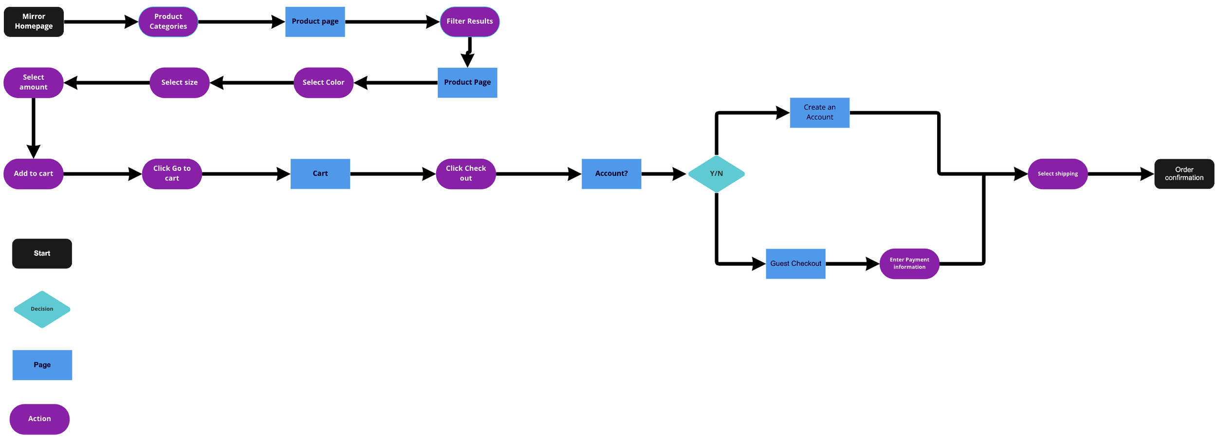
User Flow
A user flow was created so I could determine how to simplify the buying process and make it as user-friendly as possible. During my competitive analysis research, I looked at other fashion websites to try and identify the different paths the user might take.
Task Flow
A task flow was created to understand the user’s needs and how a customer would order on the website. I looked back at my card sorting exercise again to visualize how each page should be labeled and how the customer would find clothing items.
Sketches
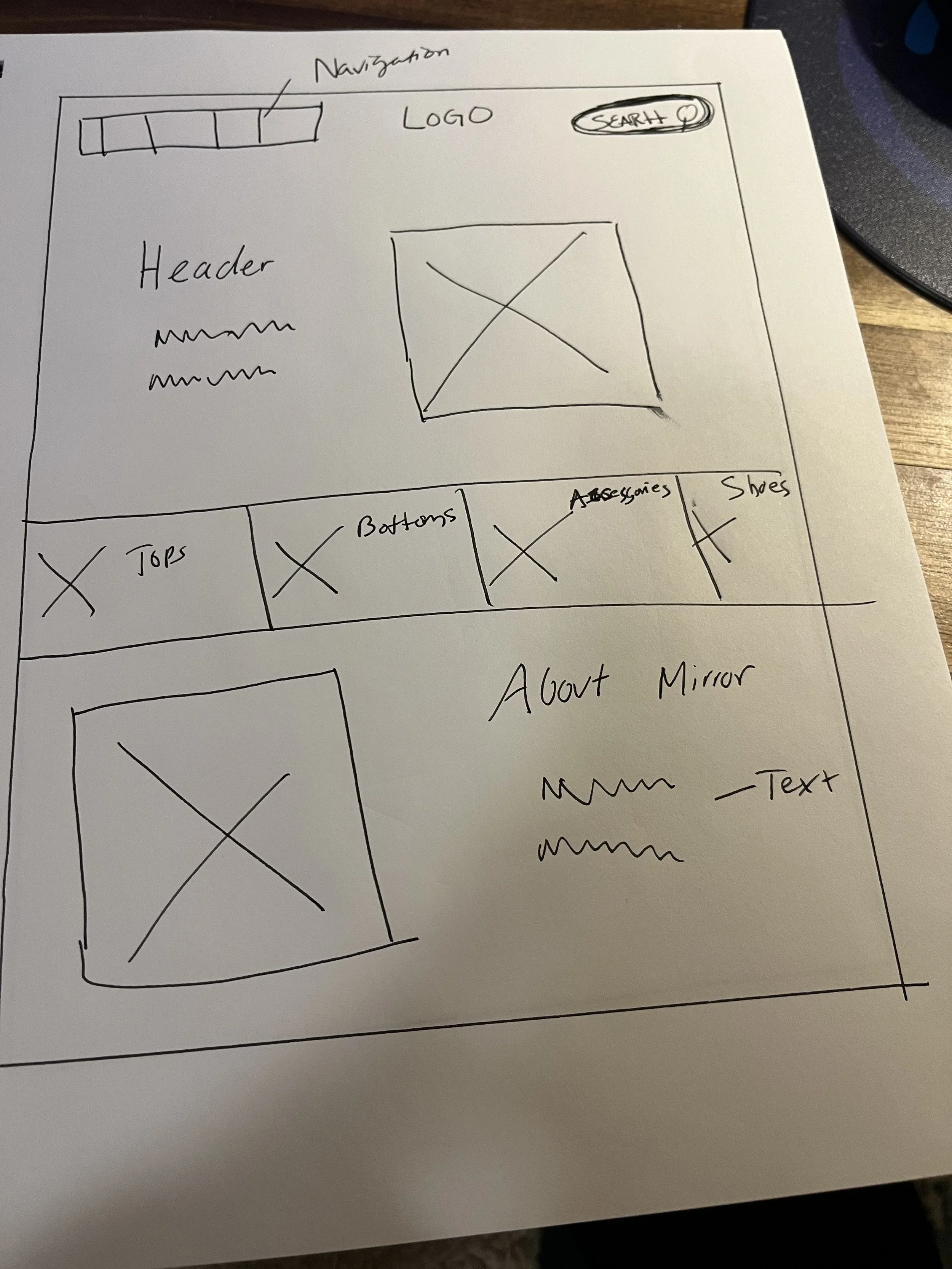
Before I started making low-fidelity wireframes, I sketched out numerous ideas for the homepage. I experimented with layouts and debated on what material should be prioritized on the page.
While experimenting with homepages, I decided that having the “About me” section was mandatory.
In the end, a carousel displayed the featured items instead, so this sketch was opted out.
At one point, a sales item section on the homepage was considered.
LOGO DEVELOPMENT
The company branding needed to have a complete digital transformation. I was trying to replicate the modern and fresh style the company was looking for and match the style of the clothing they sell. I also tried to use everyday, trendy colors and a solid black logo that pops out and draws attention.
UI
Mood Board
I was trying to go for this mood board's fresh, modern, earthy vibe.
UI Kit
I wanted to keep the color palette from getting too fussy and keep it modern. It was the same situation with the typography and buttons.
Style Tile
The style tile was based on an image found on the mood board above.
Low and High-Fidelity Wireframes
Wireframes were used to connect the site information architecture to its visual design. They were also crucial when trying to determine the functionality of the interface. There seemed to be numeration iterations between low wireframing, high fidelity, and prototyping. Some of these iterations included changing part of the color scheme, altering information groups, adding breadcrumbs, etc. While creating low-fidelity frames, I focused on the sizing and the overall layout. Then when I started the high-fidelity wireframes, I wanted to ensure that all the colors added were accessible and straightforward.
Low-Fidelity Wireframes
High-Fidelity Wireframes
Iteration and Implementation
A prototype was created to see if users could quickly identify where to find their desired product and understand how to check out without any complications.
Objectives
Test ease and usability of Mirror website
Discover potential usability issues and errors
To test the aesthetic appeal of the website.
Goals
Analyze the user interaction with the Mirror website, and identify pending frustrations with the flow, navigation, and overall design.
Identify missing objects that are necessary or desired.
Prototype
Scenario
You are browsing for a new outfit to wear on a night out with friends and are looking to purchase an outfit on Mirror’s website.
Task
Find the navy striped dress, put it in the cart, and check out.
Affinity Map
Participants
Number of participants: 6
Gender: A combination of both male and female users (4 female and 2 male)
Martial Status: A variety of married and single (2 married and 4 single)
Children: (Only 1 had children)
Age group: 25-31
Goals
100% Completion rate
100% Error-Free rate
Pros
Easy navigation
Good color scheme
Cons
Not enough filters
Not size inclusive
Maze Results
Findings
Most participants preferred to use the category navigation
No one had an issue with the color scheme or found it distracting
The site needs to be more size-inclusive
The dress/set option needs to be added.
The new arrivals section should be added to the filter
There needs to be a better place for the Wishlist button
Iterations
One of the pain points mentioned by the user was that the website was not size-inclusive. I attempted to fix this issue by adding additional sizes and dividing them into two groups: women’s and women's plus. This change will make it easier for users to find their personal size.
Another pain point from participants was that browsing and filtering needed more categories. I kept in mind some of the categories recommended on the affinity map, such as filter by occasion and sale items in testing. Then I added them to the vertical navigation, accordingly.
Conclusion
I enjoyed this project because I love fashion and hearing others’ opinions on shopping and trends. I felt that the project would have benefited significantly from interviewing more participants.
Next Steps
Make Adjustments
Implement user feedback to determine what needs to be adjusted and make changes as required. This includes adding more sizes and enhancing the filter options.
Make another prototype
Make a more extensive prototype with more advanced buttons and more frames.
Continue Testing
Use the new prototype for another usability test and continually find more feedback to improve the website.
Lesson Learned
Participant recruitment is not as easy as it seems.
It took more time than I thought to find someone who would give up some of their time to take a survey.
Make sure you find as many participants as possible.
I wish I had more participants to generate additional feedback in the beginning stages of the project.


